Food At Box (also known as F@B) is a cloud kitchen brand that primarily targets Gen X, Millennials, and Gen Z consumers through its app-based food delivery services. The brand focuses on delivering food and beverage items in well-designed, aesthetically pleasing packaging boxes to stand out from the competition and establish a strong brand identity.
The cloud kitchen offers new-age menu combinations and virtual-first ordering facilities to enhance customer experience. Apart from that, it also upholds its local culture and cuisine to resonate with customer sentiments and build a positive brand image.
02 Challenge
When F@B collaborated with BloomX, it was in its inception, and it wanted a robust go-to-market strategy to build brand positioning. We understood its business objectives and planned strategic branding approaches.
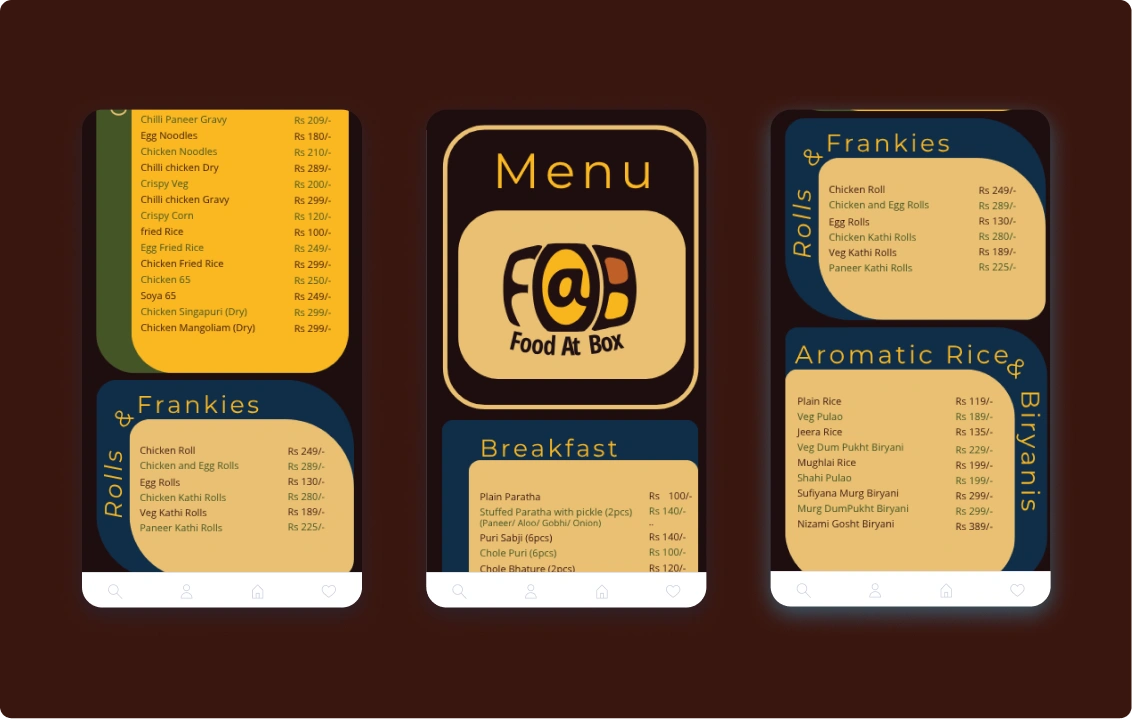
Food@Box needed a logo design that would position their brand uniquely and resonate with the young customer base.
The brand lacked mindful brand colours, typography, and messaging guidelines to persuade its target audience.
Additionally, F@B needed end-to-end branding and packaging solutions to stand out in the saturated cloud kitchen market and create brand recall.
It also wanted to attract local food connoisseurs by nurturing customer sentiment and gastronomy.
Overall, F@B wanted a unique industry positioning, brand identity, and a positive brand impression to align with young audiences and promote its curated culinary services.
03 Our Approach
BloomX adopted a pop-culture approach to make F@B relatable to young food lovers and build a standalone brand authority. We designed its brand identity, packaging, and marketing collateral to give the cloud kitchen brand a quirky yet professional look.
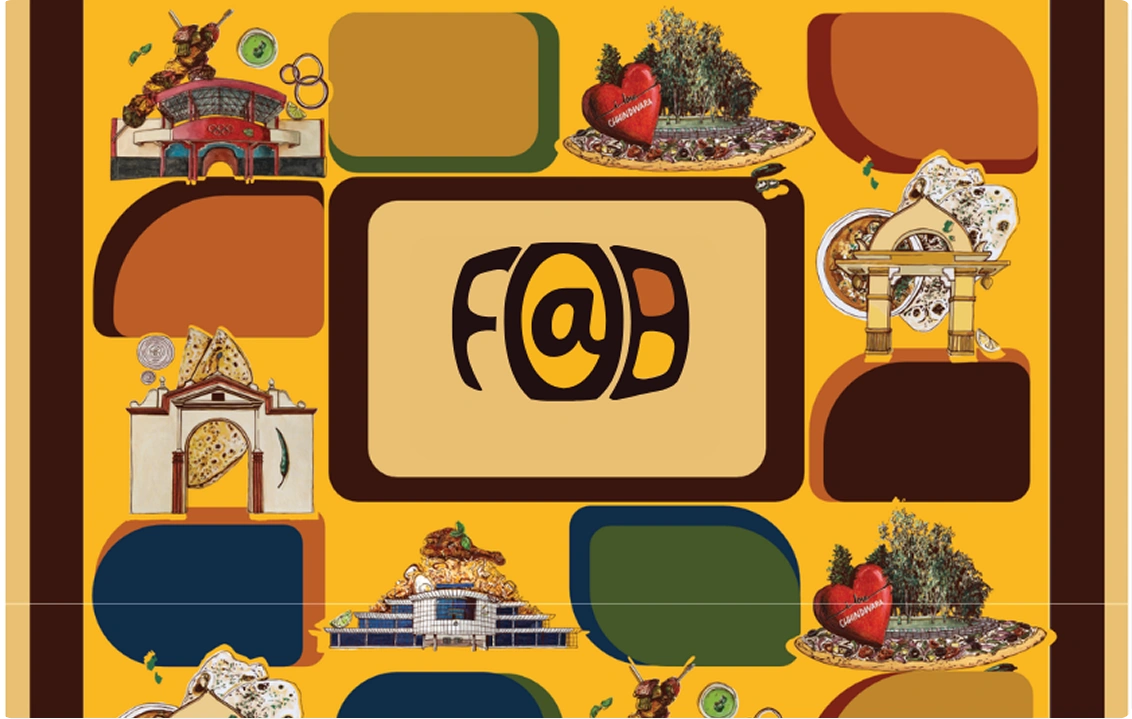
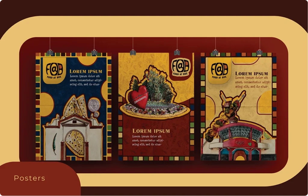
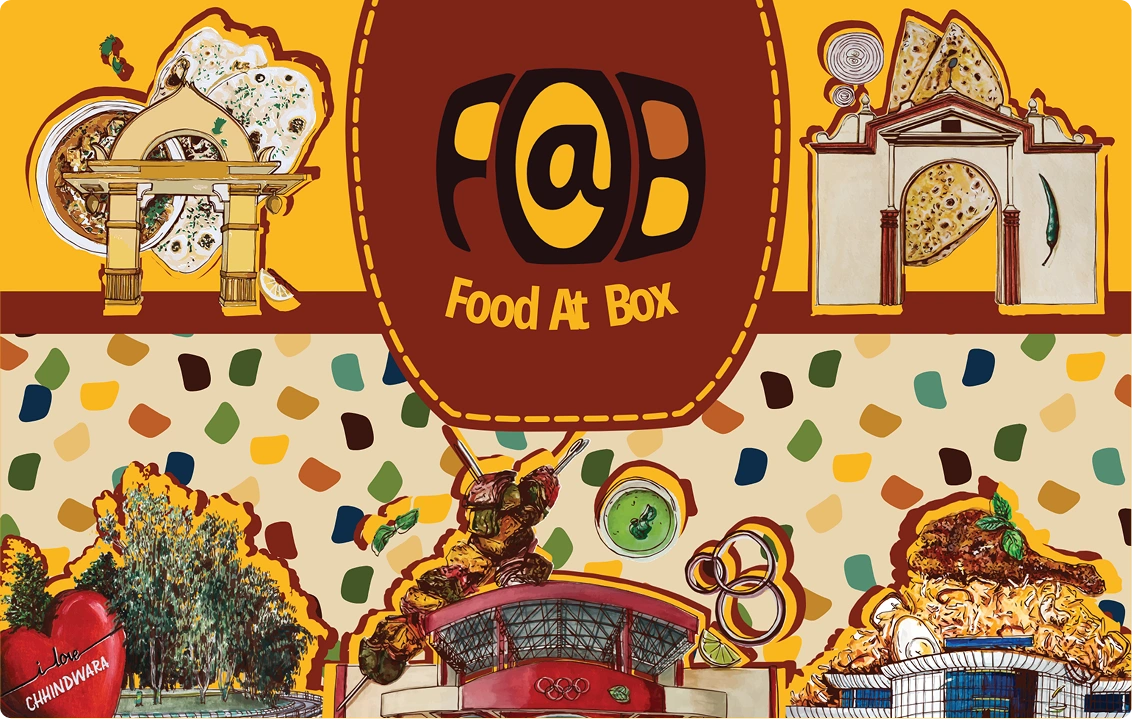
Celebrating Local Identity
Food@Box wasn’t just about food; it was about creating a cultural connection. To keep the brand rooted, we integrated visuals and inspirations from its originating city.
Local cultural elements were woven into brand communication, evoking familiarity and emotional resonance.
This gave the brand a regional nuance, making it relatable to local customers while still appealing to a wider, modern audience.
A sense of belonging was created, positioning Food@Box as a brand that feels close to home yet aspirational.
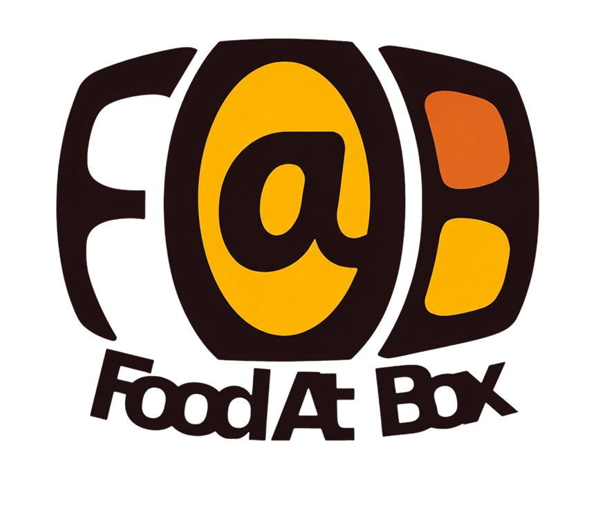
Logo Design & Brand Identity
At the core of Food@Box’s story was the traditional Thali theme. We wanted the logo to speak that language.
Thali-Inspired Logo: The “F@B” logo was stylized with shadows and contrasts to reflect the compartments of a Thali plate, subtly showcasing the brand’s USP.
Color Palette: A warm palette inspired by Indian-Mexican truck art was chosen, toned down for sophistication.
Typography: Marques Stamp and Tolyer fonts were used to evoke vintage luxury and aestheticism.
The logo positioned Food@Box as an enthusiastic yet mature brand, instantly recognizable and aligned with its core proposition.
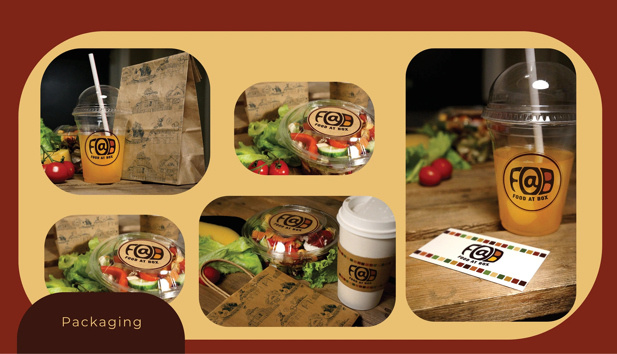
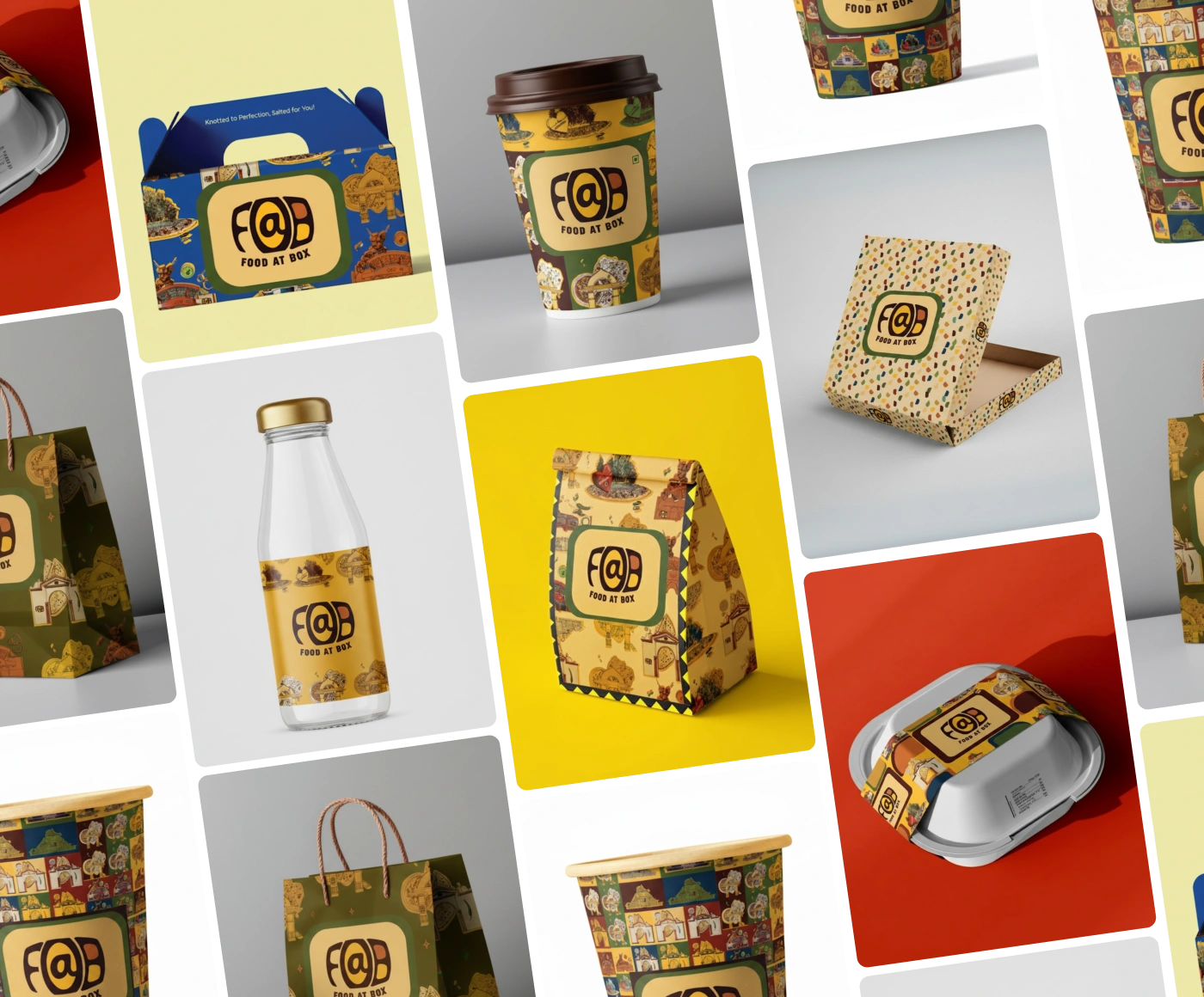
Packaging Design – Functional Meets Premium
Food@Box wanted packaging that delivered quantity, structure, and luxury. Our design strategy ensured every touchpoint carried both functionality and premium appeal.
Rectangular Cardboard Boxes: Structured to carry larger food portions neatly.
Circular Wrapping & Glasses: Designed for specific food items and beverages, ensuring spill-proof delivery.
Branded Essentials: Tissue papers, table mats, aprons, and envelopes all carried the Food@Box logo.
Premium Crockery & Accessories: Mugs, coasters, and serving ware were given a branded identity for a luxury dining experience.
The mindful packaging etched an impression of professionalism, recall, and premium service.
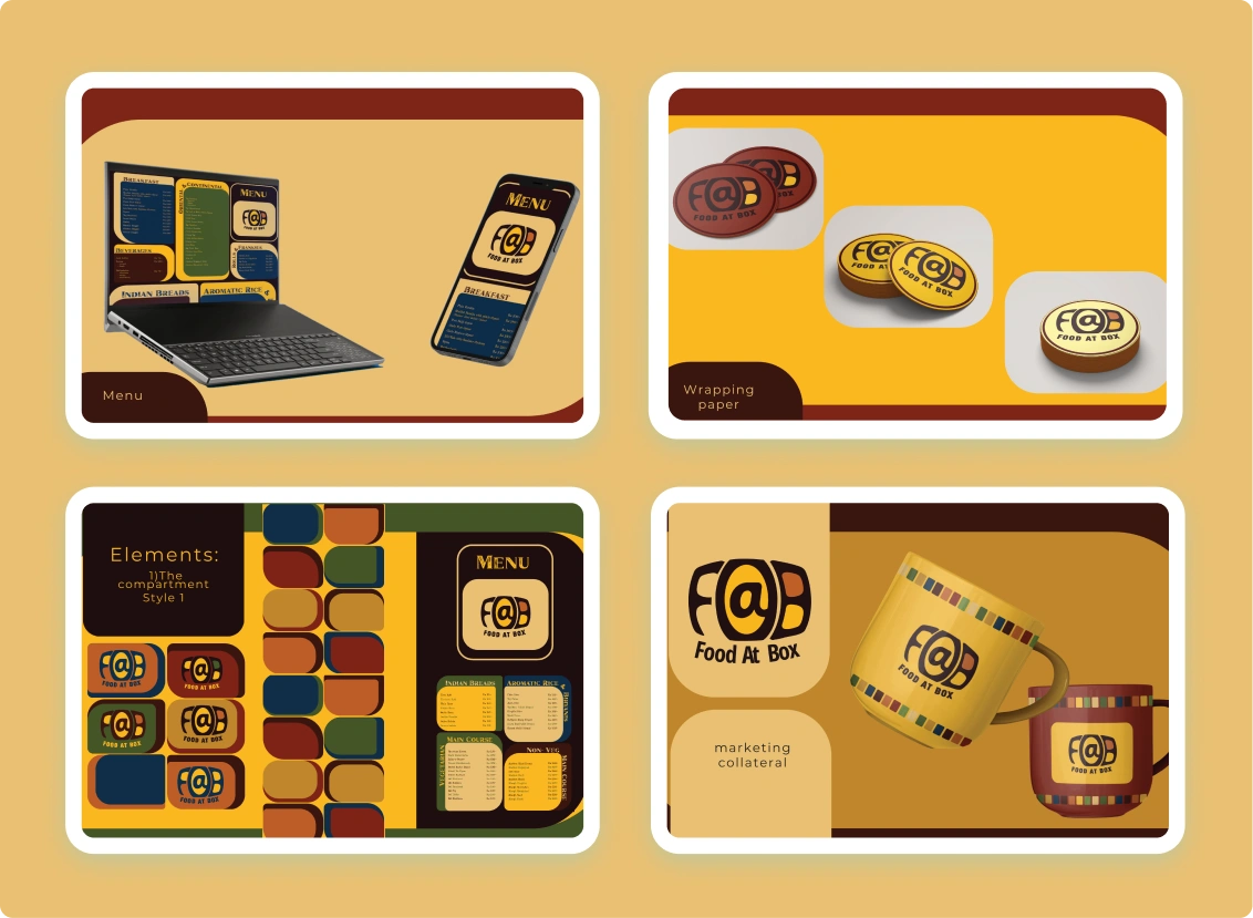
Patterns & Visual Consistency
To unify brand storytelling, we extended visual patterns across collaterals, ensuring Food@Box remained memorable at every touchpoint.
Bold, repeating patterns inspired by Indian folk art and modern geometry added distinction.
The consistency across physical and digital collaterals created cohesion and instant recall.
These patterns became visual cues of Food@Box’s personality—young, vibrant, and rooted in tradition.
Every touchpoint reinforced Food@Box’s unique personality, making the brand stand out in a competitive food delivery market.
Results
Accounts Reached
0+
Growth in Brand Awareness
+0%
month-on-month Order Growth
+0%
Conclusion
Food@Box showed how strategic branding and thoughtful packaging can transform a cloud kitchen’s market presence. Blending cultural resonance with modern design, it not only differentiated itself in a crowded space but also built strong emotional connections with its target audience.
Finally, this approach positioned Food@Box as more than just a food delivery brand. It became a lifestyle choice for young consumers with clear brand recall, consistent growth, and a loyal customer base in the food and beverage industry.