

Graphic Design INDIA · 2026 EDITION Food At Box: Creating a Distinctive Identity in a Competitive Food IndustryBloomX EditorialGraphic Design📅
Picture three delivery boxes landing on the same office desk at lunchtime. Two are plain brown cardboard. One looks like it was designed by someone who actually cares what you think of it. Which brand do you remember tomorrow?
That's the best Food At Box made. When the cloud kitchen, also known as F@B, collaborated with BloomX in 2024, it was still at its inception. It had food, a menu and an audience in mind, but no logo, no brand colours and no packaging that could stand out in a crowded delivery app.
We built its brand identity and packaging from the ground up. The results were 636,883+ accounts reached, +480% growth in brand awareness and +30% month on month order growth.
Here's how cloud kitchen branding did that work, and what you can apply to your own food brand.
Food At Box is a B2C cloud kitchen brand in India that serves customers through app based food delivery. Its core audience is young and digital: Gen X, Millennials and Gen Z consumers who order on their phones and judge a meal before the first bite.
The brand offers new age menu combinations and virtual first ordering to make the customer experience easier. It also stays close to its local culture and cuisine, which matters to the people it feeds. And from day one, F@B wanted its food to arrive in well designed, good looking boxes that set it apart from every other kitchen on the app.
That last point became the heart of the project.
A cloud kitchen has no storefront. There's no signboard, no dining room and no friendly face at the counter. The box is the brand.
When F@B partnered with us, it needed a strong go to market strategy to build its positioning. We sat down with the team, understood its business goals and mapped out the gaps.
No logo. F@B needed a logo that positioned it uniquely and spoke to a young customer base.
No brand guidelines. It lacked thoughtful brand colours, typography and messaging rules that could persuade its target audience.
No packaging system. It needed end to end branding and packaging to stand out in a saturated cloud kitchen market and build recall.
A local connection to win. It wanted to attract local food lovers by tapping into customer sentiment and regional food culture.
Put simply, F@B wanted a unique industry position, a clear brand identity and a positive first impression with young audiences. It had to look like a brand people would want to order from again.
We chose a pop culture approach. Young food lovers respond to brands that feel playful and current, so we designed F@B's identity, packaging and marketing collateral to look quirky yet professional. That balance gave it personality without making it feel like a gimmick.
Food At Box was about more than food. It was about cultural connection.
To keep the brand rooted, we brought visuals and inspiration from its home city into the brand. Local cultural elements were woven into its communication, which created familiarity and emotional resonance. Customers saw something of their own city in the brand, while the design still appealed to a wider, modern audience. The result was a sense of belonging. F@B felt close to home and aspirational at the same time.
The traditional thali sat at the centre of the F@B story, so we let the logo speak that language.
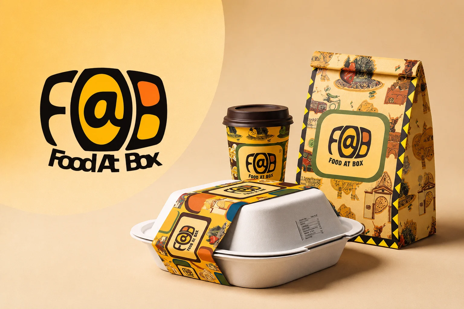
The F@B logo was stylised with shadows and contrasts that reflect the compartments of a thali plate. It quietly shows off the brand's main promise every time someone sees it.
For colour, we chose a warm palette inspired by Indian and Mexican truck art, then toned it down for a more sophisticated feel. For type, we used Marques Stamp and Tolyer fonts to bring in a sense of vintage luxury.
Together, these choices positioned F@B as an enthusiastic but mature brand. It was easy to recognise and tied directly to what it sells.
F@B wanted packaging that could handle quantity, hold its structure and still feel luxurious. That's a tough brief for delivery food, which gets tilted, stacked and carried across town before anyone opens it.
We designed every piece around both function and premium appeal. Rectangular cardboard boxes were built to carry larger food portions neatly. Circular wrapping and glasses were made for specific dishes and drinks, so deliveries arrived spill proof.
Then we carried the brand beyond the box. Tissue papers, table mats, aprons and envelopes all featured the F@B logo. Mugs, coasters and serving ware got a branded identity too, giving customers a luxury dining feel even at home.
That attention to detail left a lasting impression of professionalism and premium service. When every item in the bag carries your logo, customers notice. And they remember.
A strong logo gets attention. Consistency is what turns attention into recall.
We extended bold, repeating patterns across F@B's collateral, inspired by Indian folk art and modern geometry. Those patterns gave the brand a distinct look that customers could spot instantly, whether on a box in their hands or a post in their feed.
Keeping physical and digital materials consistent created a unified brand story.
The patterns became visual cues for F@B's personality: Young, vibrant and rooted in tradition. Every touchpoint reinforced who the brand was, which helped it stand out in a very competitive food delivery market.
Here's what the new brand achieved for Food At Box.
The brand reached 636,883+ accounts. For a cloud kitchen that started at inception with no visual identity, that's a large audience seeing and engaging with a brand built from a blank page.
F@B saw +480% growth in brand awareness. That jump shows what happens when a brand finally has a face people can recognise. A distinctive logo, a consistent palette and memorable patterns gave customers something to hold onto.
Most importantly for the business, orders grew by +30% month on month. Awareness only matters if it turns into revenue, and steady monthly order growth is the clearest proof that the branding pulled its weight.

If you run a cloud kitchen, your packaging does the job a restaurant's interior would normally do. It's your first impression, your dining room and your business card rolled into one.
Start with a story that's true to your food, the way the thali shaped F@B's logo. Pull in local culture so customers feel at home. Design packaging that survives delivery and still feels special when it's opened. Then repeat your visual language everywhere, on boxes, bags and social posts alike, until people recognise you before they read your name.
How would your customers describe your brand if they only ever saw your box?
Food At Box shows how strategic branding and thoughtful packaging can change a cloud kitchen's place in the market. By blending cultural resonance with modern design, F@B set itself apart in a crowded space and built real emotional connections with its audience.
It became more than a food delivery brand. For young consumers, it's a lifestyle choice with clear brand recall, consistent growth and a loyal customer base.
If you're launching or relaunching a food brand and want packaging people remember, we'd love to help you build it.

READY TO SCALE SMARTER
Stop guessing.
Start compounding.
Book a free strategy call with BloomX and see what AI-powered performance marketing can do for your ROAS – or explore what we’ve built for brands like yours.
Graphic Design INDIA · 2026 EDITION Food At Box: Creating a Distinctive Identity in a Competitive Food IndustryBloomX EditorialGraphic Design📅

Graphic Design INDIA · 2026 EDITION How Kuku FM Built a Distinctive Brand Through Strategic Creative Thinking BloomX Editorial Graphic

Digital Marketing INDIA · 2026 EDITION Why Small Businesses Need Digital Marketing BloomX Editorial Digital Marketing 📅 October 2026⏱ 12