


Digital Marketing INDIA · 2026 EDITION Why Small Businesses Need Digital MarketingBloomX EditorialDigital Marketing📅 October 2026⏱ 12 min readGreat Product,
An enterprise buyer lands on your website. They've heard good things about your firm. Within ten seconds, a cluttered menu, a slow mobile page and a missing contact button tell them a very different story.
That was Agkiya's reality before we started working together.
Agkiya is a digital transformation consulting brand under the SMB 360 Group, building AI-powered, IoT-enabled solutions for enterprises. The expertise was real. The website didn't show it. At BloomX, we took on a full B2B website redesign for Agkiya and delivered it in 90 days. Below, we'll walk you through the four lessons from that build, plus the numbers that followed.
A weak website costs B2B firms deals they never hear about, because prospects judge your capability by your site before they ever call. Before a procurement team books a meeting, someone has already scanned your homepage, services and careers page, often on a phone.
If those pages feel dated, the buyer assumes your delivery might be too. Nobody emails you to say they left. They just don't come back.
When we audited Agkiya's existing site, five problems stood out:
Each is fixable on its own. Together, they created a credibility gap. Enterprise visitors couldn't find what they needed. Job applicants had no clear route in. Partners had little reason to stay. And nothing on the page pushed anyone toward a conversation.
Start a B2B website redesign by mapping who visits your site and what each group needs to do next.
We didn't open a design tool first. Agkiya's audience fell into three clear groups: enterprise clients, job applicants and partners. Each arrived with a different question. So we rebuilt the site structure around persona-centric navigation, giving every audience a short, frictionless path to what it came for.
Then we rewrote the content. The old copy described services. The new copy talks about impact, results and value, positioning Agkiya as a problem solver for enterprises. The brand voice we shaped is authoritative yet approachable, formal enough for a CXO and still easy to scan on a small screen.
The final layer was conversion flow. We embedded clear CTAs and inquiry pathways at the exact points where a visitor is most likely to act, so a reader finishing a service page now sees an obvious next step instead of a dead end.
Enterprise buyers trust calm, minimal design with clear actions, so the visual system should reduce noise and make every next step obvious.
We moved Agkiya to a clean corporate aesthetic with a refined grey and white palette. Under the surface sits a responsive, grid-based layout designed mobile first, which holds the content hierarchy together when a decision maker opens your link on a phone between meetings.
A handful of specific choices did most of the heavy lifting:
That career flow deserves a closer look. Most consulting sites bury hiring in the footer. Giving applicants their own journey turned Agkiya's website into a talent pipeline as well as a sales tool. If your visual identity needs work before a redesign begins, our branding team usually starts there.
Faster load times and accessible design keep more visitors on the page, which makes performance a conversion factor.
Our developers minimised assets and optimised scripts for fast rendering, which reduced Agkiya's load times by 40%. That gain matters most when someone opens the site on a patchy mobile connection, exactly the moment a slow page gets abandoned.
Accessibility got the same attention. We improved colour contrast, used semantic HTML and added full keyboard navigation, in line with the W3C's WCAG guidelines. Then we ran extensive testing to keep the platform reliable as traffic grows.
The post-launch technical audit confirmed the work: 93 for Performance, 93 for Accessibility and 96 for Best Practices.
Within 90 days of launch, the data showed the redesign was doing its job.
Visitors stayed longer, with average session duration up by [session duration growth]. Mobile bounce rate fell by [mobile bounce rate reduction], a shift that lines up with the 40% faster load times. CTA engagement grew by [CTA engagement growth] once every key page had a clear next step. Career applications jumped by [career applications growth] after the dedicated hiring flow went live.
Put simply, visitors started doing more once they arrived. You can see the live result at agkiya.com, and the complete project breakdown is in our Agkiya case study.

You don't need Agkiya's exact brief to use its lessons.
Four ideas carry over to almost any B2B website redesign:
On the fourth point, track Interaction to Next Paint (INP), the Core Web Vitals metric that replaced First Input Delay in March 2024. It measures how quickly your page responds when someone taps a button, which is exactly where B2B leads get lost.
Start with whichever lesson hurts most on your current site. For many firms we review, it's the missing conversion path. Visitors read, nod and leave, because nobody showed them what to do next.
So here's the question worth sitting with: Is your website telling buyers the same story your sales team does?

READY TO SCALE SMARTER
Stop guessing.
Start compounding.
Book a free strategy call with BloomX and see what AI-powered performance marketing can do for your ROAS – or explore what we’ve built for brands like yours.
Digital Marketing INDIA · 2026 EDITION Why Small Businesses Need Digital MarketingBloomX EditorialDigital Marketing📅 October 2026⏱ 12 min readGreat Product,
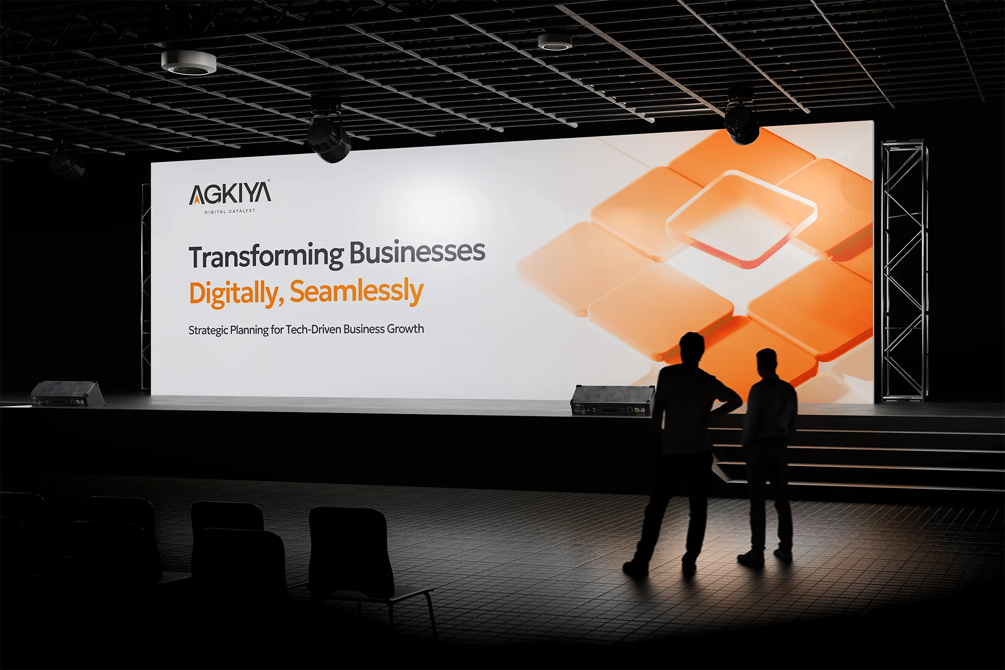
Website Development INDIA · 2026 EDITION How Agkiya Transformed Its B2B Website for Better UX, Performance and Conversions BloomX Editorial
Brand Strategy INDIA · 2026 EDITION Security Company Branding: How FortHound Built a Premium Brand Around Trust, Valour and Duty